Personal Background
Linus Lohoff is German and has Brazilian roots. He lives in Barcelona and works as an Art Director. He has had over 8 years of professional experience in the creative sector. He also has worked in agencies like Saatchi & Saatchi, BOROS, and Vasava Studios. He got some ideas to start photography from looking at covers of music. He was born in Germany in 1985 and is still alive.
Style
His style is very minimal. He likes to use not that many objects and he likes to stick to the same color scheme in each photo. He does a lot of object photography. He just wants to show the essence of the idea and not include extra unnecessary items in the photo. He likes to use the square format when he takes photos because he started with a camera that took photos in square format and fell in love with the way it looks.
Philosophy
He tries to communicate inspiration in his photos. He wants to show simpleness but using not that many objects in his photos He likes to remove the extra objects and show the essence of the idea. He considers his work minimal work is minimal and clean. He uses visual cues like color, material, typography, photography, language, and concept. These make the photos visually appealing and make his ideas come to life.
Influence
He was influenced by his father who was a photographer. He used to be into music more and got into photography late but his father was his main inspiration. He was also very influenced by Henrik Vibskov, Louisa Parris or Iris Van Herpen and their collections. I am influenced by his photography because I like how simple his photos are and the way they use the same color scheme. I like how he uses the square frame so it it looks different and is very symmetrical to look at.
Compare and Contrast
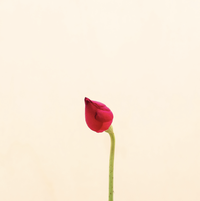
Flower |
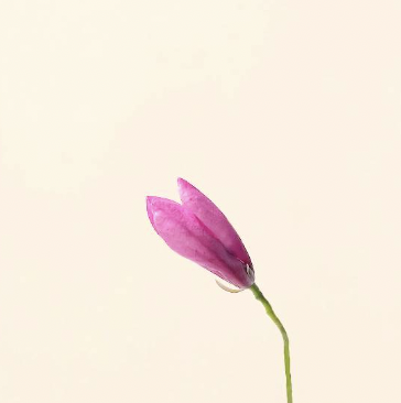
Pink Glory |
This photo was hard to take because finding a flower that looks similar enough to the original flower was complicated. In photoshop I had to edit the background a lot because it didn't match the original picture. Since the flower wasn’t as similar I tried to make the angle more similar so it would look like the original. The lighting was also a key point since the original doesn't have many shadows and it just has light shining on it.
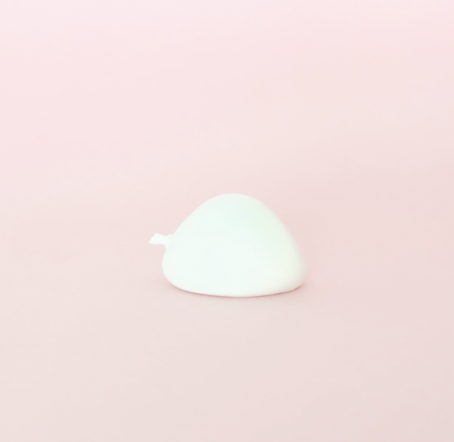
Things II |
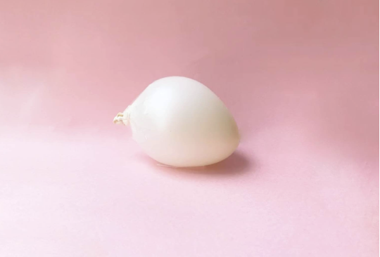
Balloon Shadows |
This photo was hard to make the balloon look like the original and make it stay. I filled the balloon up with water and air but it wouldn’t stay still on the paper I used, so I used tape to help the balloon stay. I also had to edit the background to make it seamless and have no cutoffs in the paper. I had to make sure the angle was similar to the original so the picture would look more similar to the original.
Constructed Picture |
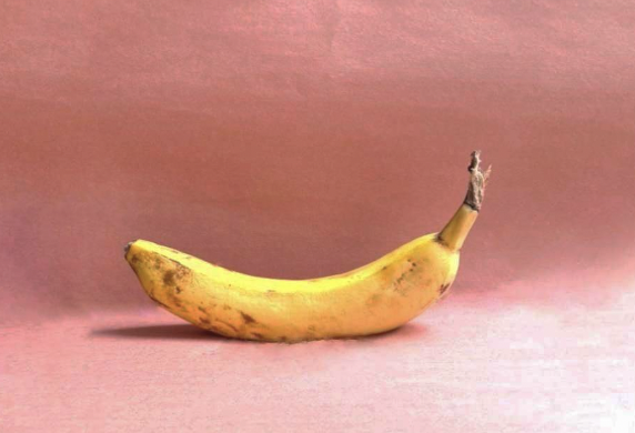
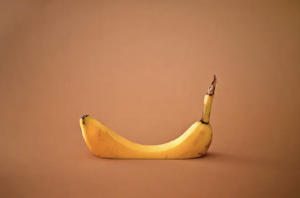
Sinking Banana |
This photo was not that hard to take. The hardest part of taking these photos was making the background look ok and keeping the shadow while I was editing it. It was fun cutting the bottom part of the banana off to create the illusion. In photoshop I had to create a background that flows more and make the image darker. I really like how this image turned out because it looks pretty similar to the original photo.
Artist Statement
I really liked taking these photos. It showed me how to use what I had and to use photoshop to help with my images. My first photo (Sinking Banana) was really fun to take but showed many challenges. I like how it displays something sinking while staying afloat at the same time. My second photo (Pink Glory) was very fun to take. It shows how the new season has sprung and how bright life can be. My third photo (Balloon Shadows) shows how you can be coasting across life. These photos showed me a lot about using what you have and to take many different photos.
